

The leading online marketplace to discover, buy, and sell fine art around the world.
My Role | UX Designer & Researcher
Team | 4 Designers & Researchers
Duration | 4 Weeks
Millennial art consumers want to purchase art they like, but they need a better way to:
Find art within their budgets.
Engage with art & artists they like.
Feel a connection to their local community.
Featured artwork shown is not affordable.
No way to purchase or browse for art as a guest.
No way to connect with artists on social or locally.
Existing Home Screen
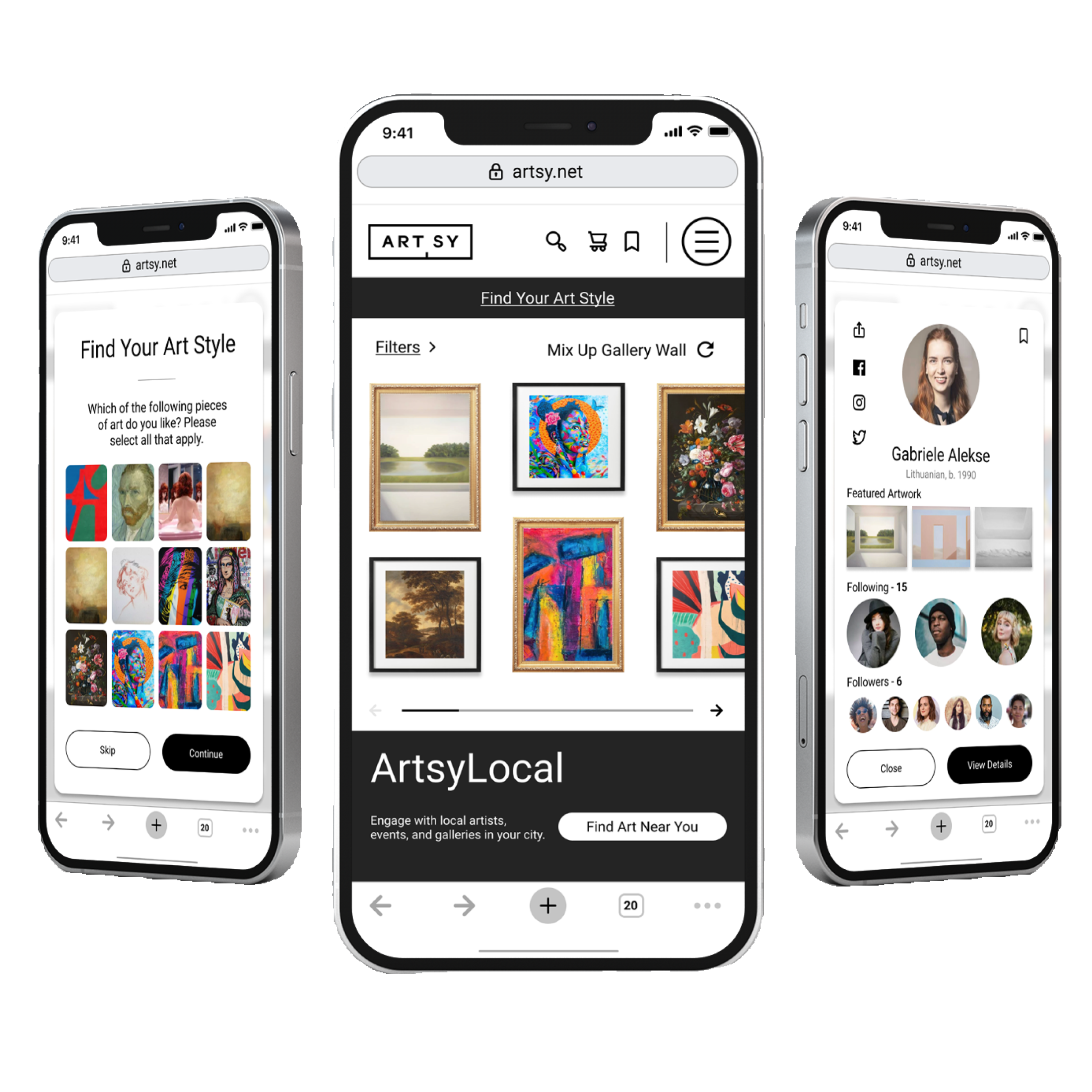
We proposed 5 new features for Artsy:
Online shopping cart.
Guest browsing & purchasing.
Art finding guidance & quiz.
Local event & show finder.
Follow artists on social.
User research, ideation sketches, wireflows, mid-fi & hi-fi prototypes, usability tests, & figma design files.
Proposed Home Screen
6 user interviews with millennial art enthusiasts showed trending goals & frustrations with the art market.
We narrowed down these goals & frustrations into 2 personas:
Jackie.
Jackie wants to purchase affordable art for her own space, but she doesn’t know where to begin when searching for art.
I want to stay under budget.
I want to feel connected to and support artists with similar beliefs.
I want to keep up with trends.
I get discouraged when finding art I can’t afford.
I don’t feel unique when buying commercial art.
I don’t don’t feel knowledgeable on how to find art I like.

Art Hobbyist & Enthusiast • 22
Gordon.
An experienced art collector, Gordon wants to find art for his gallery & growing collection, but he currently needs fresh inspiration.
I want to buy art that will increase in value over time.
I want to gain a fresh perspective for my job.
I want to see art in person before purchasing it.
I need to understand the value of artwork.
I dislike when artists are not properly credited.
I have to see the quality of artwork in person to know its worth.

Art Collector & Curator • 29
After conducting 6 usability tests, we found that target users struggled to purchase art & connect with artists on Artsy’s existing mobile website:
Users were unable to make purchases as guests:
Users were prompted to create an account in order to purchase art.
All users expressed that they wanted the ability to check out without signing up.
Users found there was no way to follow artists on social media:
All users expressed interest in wanting to follow artists on social media.
All users were unable to find a way to connect with artists.
Users found the site to be intimidating without experience:
2/6 users expressed that they wanted guidance on what artwork to pick.
4/6 users expressed that the artwork was not affordable enough for them.
Competitive analysis showed that Artsy’s competition utilizes features that art consumers need in order to achieve their goals:
Millennial art consumers want to purchase art they like, but they need a better way to:
Find art within their budgets.
Engage with art & artists they like.
Feel a connection to their local community.

Artsy’s existing website isn’t helping because:
Users find Artsy to be intimidating because the featured artwork shown is not affordable.
There is no way to purchase art without creating an account.
There is no way to connect with artists on social media.
Existing Home Page
We proposed 5 new features to help users purchase & connect with art they like:
Online shopping cart & guest browsing:
We introduced an interactive, gamified gallery wall so intimidated & experienced users can feel inspired with new art.
Users can browse for and purchase art online without having to create an account.
Art finding guidance & quiz:
Users who don’t know where to start looking for art now have the option to take a quick art style & affordability quiz.
Local events & show finder:
Users can use the new Artsy Local feature to find inspiration and feel connected to artists local to them.
Follow artists on social:
Users can now connect with their favorite artists on social to keep up with the latest trends.
6 usability tests with target users showed that our new features inspired users to explore new art, while some features were hard to locate initially:
We took the usability test results to heart and made some design changes:
Re-established hierarchy in menu navigation with a card sorting exercise.
Re-ordered the style quiz to pop up right away, and option to skip.
High-Fi Prototype
Next steps:
Is the art style quiz helping ease Jackie’s frustrations?
Does Gordon find any use for the art style quiz?
Are users getting where they need to go through the menu?
Art Style Quiz
Navigation Menu