


A tool for parents to teach their children long-term healthy money habits.
My Role | UX Designer & Researcher
Team | 5 Designers & Researchers, CEO, & Software Engineer
Duration | 6 Weeks
Parents want to teach their children healthy money habits, but they need help figuring out where & how to start.
1. Onboarding screens are too long & unclear.
2. Dashboard contains too much info.
3. Bucket feature functionality is glitchy and complicated.
Existing Dashboard Screen
We proposed a full redesign, better guiding parents through the app to teach their children healthy money habits.
1. Re-worked & re-ordered onboarding screens.
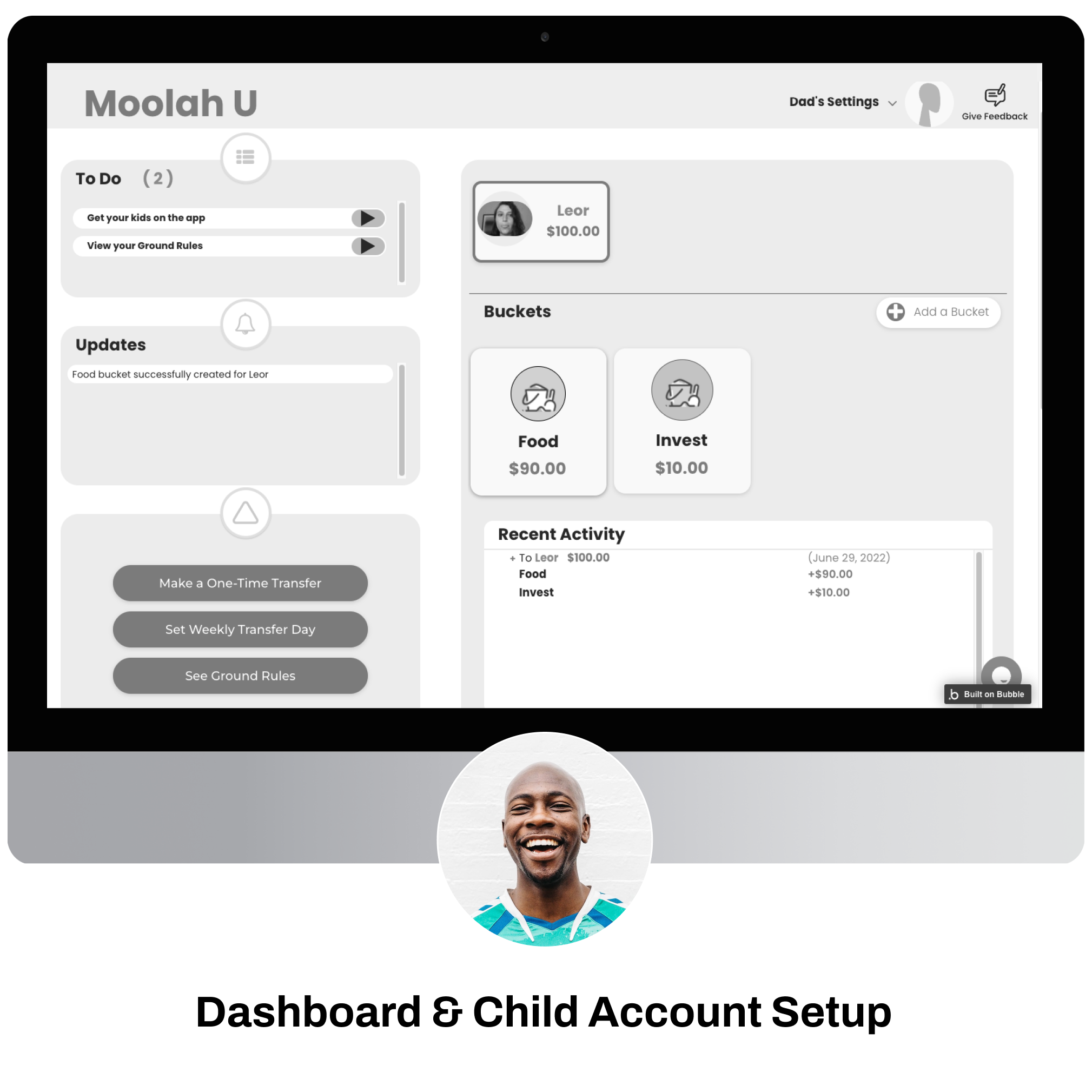
2. Simplified dashboard.
3. Streamlined bucket feature editing.
User research, ideation sketches, wireflows, mid-fi & hi-fi prototypes, usability tests, & figma design files.
Proposed Dashboard Screen
6 user interviews showed that parents were struggling to teach their children healthy money habits:
New to Moolah U, Alex wants to set his kids (ages 8, 11, & 13) up for financial success, but his parents never taught him about healthy money habits.
I want to help my kids become financially independent.
I want to easily keep track of my kid’s financial learning.
I want to learn what healthy financial habits look like.
I don’t know where to start teaching kids about money.
I don’t have a strong understanding of finances.
My kids always ask for money without knowing its value.

Social Worker • 41
An existing Moolah U user, Jessie wants to set her kids (ages 12 & 16) up for financial success, but she finds she’s not consistent enough with teaching them the value of money.
I want to consistently teach my kids the value of money.
I want to help my kids become financially independent.
I want to create opportunities to financially empower my kids.
I’m not consistent enough in teaching my kids.
I don’t have a strong understanding of finances.
I’m easily confused by too much information at once.

Broker • 48
6 usability tests showed that the existing app’s main features were lengthy & overwhelming for parents:
Initial onboarding of the app was too long, and parents did not pay attention to the purpose of the app.
5/6 users did not pay attention to the 5 purpose & onboarding screens during sign-up.
All users expressed they wanted to create an account before going through onboarding.
Existing Onboarding Screen
Once signed in for the first time, new users found the main dashboard overwhelming & confusing because they didn’t pay attention to onboarding.
5/6 users experienced cognitive overload when on the main dashboard for the first time.
2/6 users understood what a bucket was & how to navigate to it.
4/6 users didn’t like that they could only set up one child account.
Existing Dashboard Screen
New & existing users found the app’s main feature (Bucket feature) to be confusing, complicated, & glitchy.
4/6 users had difficulty understanding & navigating the money bucket feature editing functionality.
5/6 users experienced cognitive overload when editing a bucket for the first time.
Existing Bucket Editing Screen
New & existing parent users want to teach their children healthy money habits, but they need a better way to figure out where & how to start.

The existing app is confusing to new & existing parent users due to a lengthy initial onboarding, overloaded dashboard, and complicated Bucket feature functionality.
Existing Dashboard Screen
We relocated, reduced, and reworked the onboarding screens & their content for parents to better grasp the app’s purpose and Bucket feature functionality


New condensed main dashboard & simplified child account setup process to reduce initial cognitive load.
Have parents create a bucket as part of the child account set up to help them learn by doing.
Enable parents to set up multiple child accounts.
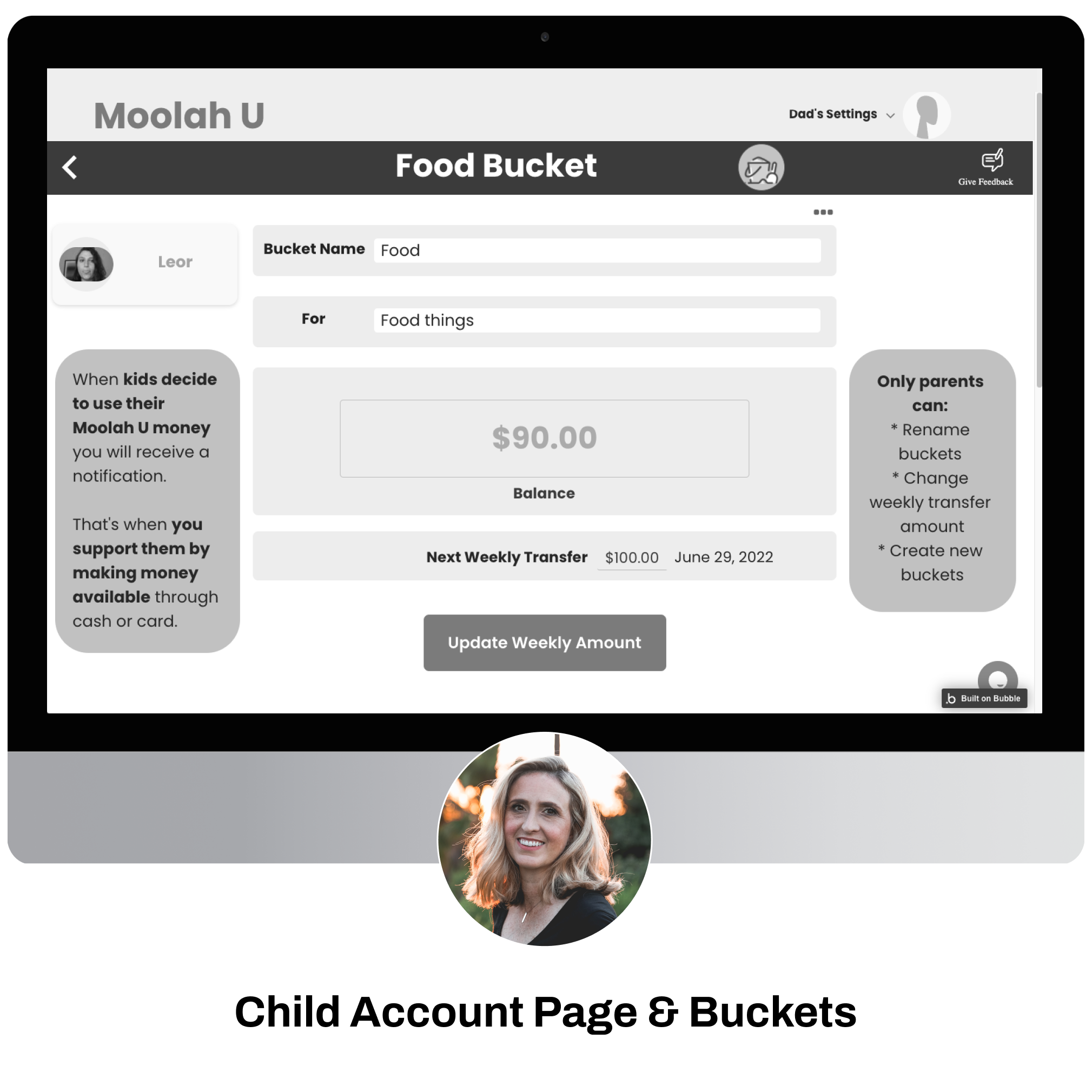
New child account page & streamlined bucket editing functionality built within the child account.
Built-out a child account page to house all bucket feature-related elements.
Streamlined the bucket editing functionality to reduce errors and confusion.

6 usability tests of our redesign showed us that users found the bucket feature way more intuitive, while they still had a hard time paying attention to initial onboarding:
Handoff of figma & style guide files to client & Software Engineer to continue testing.
User research, ideation sketches, wireflows, mid-fi & hi-fi prototypes, usability tests, & figma design files.
High-Fi Prototype
Moolah U’s next Beta Release is planned for January 2023. We agreed to continue providing advisement for the following:
Paywall location.
Design iterations.
Implementation of design.
